Zalgo Unicode refers to the specific block of Unicode combining diacritical marks — characters in the range U+0300 through U+036F — that, when stacked above and below regular letters in large numbers, produce the dripping, corrupted appearance known as Zalgo text. These are not broken characters or rendering glitches. They are valid, standardized symbols that the Unicode Consortium built for an entirely different purpose, and Zalgo text exists because internet users in 2004 figured out how to use them in a way nobody originally intended.
That is the short answer. The longer answer involves understanding why these specific characters behave the way they do, why some platforms render them more aggressively than others, and why a 22-year-old internet trick still works perfectly on every iPhone, Android, and Discord server in 2026. This guide walks through all of it — the technical mechanics, the practical applications, the accessibility tradeoffs nobody talks about, and the misconceptions that even experienced internet users still get wrong.
What Exactly Are Zalgo Unicode Characters?
Every character you type — letters, numbers, emoji, punctuation — exists as a defined point inside the Unicode standard, the system that lets every device on the planet display text consistently. Somewhere inside that enormous standard sits a small, unglamorous category called combining diacritical marks.
These marks were designed to do something quiet and useful: attach an accent to a letter that already exists. Type the letter “e,” add a combining acute accent mark, and you get “é.” Type “n,” add a combining tilde, and you get “ñ.” This is how Spanish, French, Vietnamese, and dozens of other languages render accented characters using a base alphabet plus a small modifier.
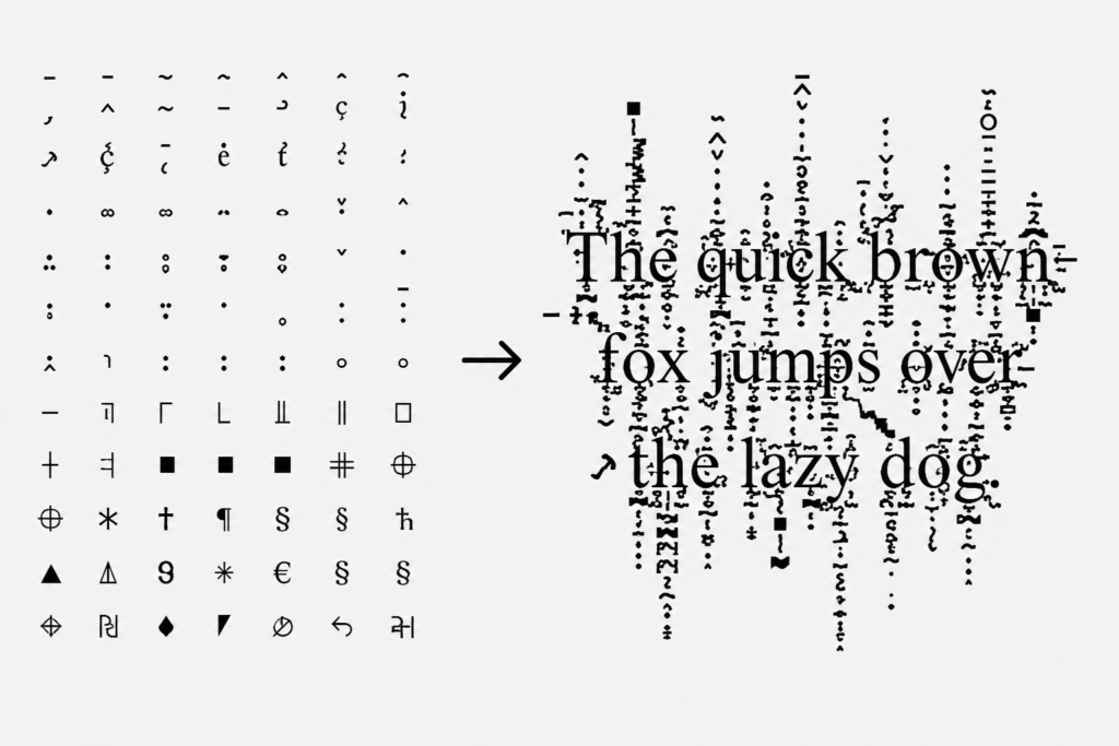
Here is the detail that makes Zalgo text possible: Unicode never set a hard limit on how many combining marks you can stack onto a single base character. A typical language only ever needs one, maybe two. Nothing in the technical specification stops software from applying twenty, forty, or even a hundred of these marks to the same letter.
When a generator does exactly that — piling dozens of combining marks above, below, and through a single character — the rendering engine on your phone or browser tries to draw every single one in its assigned position relative to that letter. Since there are far more marks than the letter has room for, they spill outward. Some shoot upward past the line above. Some drop down into the line below. The result looks like the letter is dissolving or glitching out of its own boundary — exactly the visual effect people associate with Zalgo text.
Why Does It Look Distorted Instead of Just Breaking?
This is a question that trips up a lot of people the first time they think about it seriously. If you stack that many marks onto one character, why does the text still display at all instead of just throwing an error?
The answer comes down to how font rendering actually works. Your device does not reject unexpected combining marks — it tries to honor every single one, positioning each new mark relative to where the previous one ended. This is intentional design, because some real-world languages do legitimately stack two or three marks on rare occasions, and the system needs to handle that gracefully.
Zalgo text exploits that graceful handling at an extreme scale. The renderer is not malfunctioning. It is doing exactly what it was built to do — just being asked to do it forty times in a row on the same letter. The “glitch” you see is not a bug in your phone. It is correct behavior applied to an absurd input.
This is also why Zalgo text never actually crashes modern devices, despite a persistent internet myth claiming otherwise. Older browsers from over a decade ago occasionally struggled with extremely long strings of stacked marks, which is where that reputation originated. Current iOS, Android, and desktop browsers handle even maximum-intensity Zalgo text without any performance issue.
The Three Categories of Combining Marks at Play
Not every combining mark behaves identically, and understanding the three rough categories helps explain why Zalgo text looks the way it does rather than just looking randomly messy.
Marks that stack above the letter push distortion upward, creating the effect of the character bleeding into the line above it. These tend to dominate at lower intensity, since a handful of upward marks already reads as clearly abnormal.
Marks that stack below the letter create the downward drip most people associate with the “melting” look of heavier Zalgo text. This usually carries the most dramatic visual weight at higher intensities, since there is more vertical room below a line of text than above it.
Marks that overlay or strike through the letter add a third layer directly across the character, which gives maximum-intensity Zalgo text its almost-illegible quality. A letter with heavy marks above, below, and through it simultaneously stops reading as a letter and starts reading as pure visual noise.
A generator typically blends all three categories together, adjusting the ratio based on the intensity setting a user selects.
How Zalgo Unicode Became a Cultural Phenomenon
The technique itself predates its cultural meaning by exactly zero days — the two arrived together in 2004. A Something Awful forum member began posting image macros of cartoon characters with corrupted dialogue, attributing the distortion to an unseen force the community started calling Zalgo. The text effect and the horror character were inseparable from the very first post.
What is worth noting is how the technical trick spread faster and further than the character mythology around it. Within a few years, Zalgo-style distortion had become its own standalone tool used far outside any horror context — gaming usernames, social media bios, comedic posts, and eventually a recognized category within “surreal memes,” content built around bizarre and impossible-feeling visuals rather than direct horror. That same fandom energy is what eventually pushed people to ask an entirely different question about the character behind the text — our piece on what Zalgo would look like as a person covers two decades of fan interpretation on that front.
For the full account of where the character came from and how the original 2004 posts evolved into today’s internet folklore, our pillar guide on the Zalgo origin story covers that history in depth. This article focuses specifically on the characters themselves rather than the character.
Practical Examples: Light, Medium, and Heavy Distortion
Seeing the intensity scale side by side makes the mechanics easier to grasp than any explanation alone.
A lightly distorted word might carry just two or three combining marks per letter — enough to look noticeably “off” while remaining completely readable. This is the level most people reach for in a Discord display name, where legibility still matters.
A medium intensity version stacks closer to ten marks per letter. Words are still readable with effort, but the visual weight becomes obvious immediately, and the text clearly signals “this was generated, not typed.”
A heavy or maximum intensity version can push past twenty or thirty marks per letter. At this level, individual characters become difficult to identify without already knowing what the underlying word says — the register most associated with horror content and dramatic reveals in chat.
For copy-paste-ready examples across all three intensity levels without generating anything yourself, our cursed Unicode symbols list collects working samples you can grab directly.
Where People Actually Use This in 2026
Gaming usernames remain one of the most common applications. Players on Discord, Steam, and various game lobbies use light-to-medium Zalgo distortion to stand out in a crowded friends list, since most platforms accept a moderate number of combining marks in a display name even when they restrict heavier ones in account-level usernames.
Social media bios on TikTok and Instagram favor lighter distortion for the same reason — the text needs to stay readable enough that someone scrolling past actually understands it, while still looking distinctly different from every plain-text bio on the platform.
Group chats see some of the heaviest use of maximum-intensity Zalgo text specifically because legibility does not matter there. A single corrupted word dropped into an otherwise normal conversation produces a reaction precisely because nobody expects it.
Creative writing and horror content use Zalgo text as a formatting device rather than a label — a single sentence rendered in heavy distortion at a key moment in a creepypasta story signals tonal shift without needing additional explanation.
Accessibility Considerations Nobody Mentions
This is worth addressing directly because most guides skip it entirely. Heavy Zalgo text creates real friction for screen readers and assistive technology. Combining marks stacked in large numbers can cause screen reading software to either read each mark aloud individually — producing an unusable wall of noise — or skip the content altogether depending on the specific software involved.
This does not mean Zalgo text should never be used. Heavy distortion is a poor choice for anything that needs to communicate critical information to every visitor, and a reasonable choice for purely decorative content where the visual effect is the entire point. Most experienced creators reserve maximum intensity for situations where the text is genuinely meant to look corrupted, and pair it with plain text when the underlying message actually matters.
Common Misconceptions Worth Clearing Up
A few persistent myths circulate about Zalgo Unicode that are worth correcting directly.
It is not a font. Nothing about Zalgo text requires installing anything on your device. It is standard Unicode that any system already supports, which is precisely why it pastes correctly across practically every app and platform without special compatibility steps.
It cannot “hack” or damage anything you paste it into. The persistent rumor that Zalgo text can crash websites or corrupt databases traces back to genuinely old software from over a decade ago that handled extremely long character strings poorly. Modern systems handle it without issue.
It is not the same thing in every context. “Zalgo text,” “glitch text,” and “void text” get used interchangeably by casual internet users, but they typically describe different intensity levels and stylistic choices built from the same underlying combining mark technique rather than three separate systems.
Generate Your Own Zalgo Unicode Text
Understanding the mechanics behind Zalgo text is interesting, but most people landing on this topic want to actually produce it. Our Zalgo text generator applies these exact combining mark techniques instantly, with adjustable intensity from subtle to maximum distortion.
If you want something lighter that stays readable for usernames and bios, our glitch text generator uses a milder version of the same approach. For the heavier, more atmospheric variant popular in gaming and horror communities, our void text generator covers that style specifically.
And if you have ever wondered about the word “Zalgo” itself rather than the text effect, our Zalgo name meaning guide breaks down where the name actually came from.
Free. Unlimited. No sign-up required. Try it at Cursed Text Creater right now.
Frequently Asked Questions
What Unicode range do Zalgo characters come from?
The primary combining diacritical marks used in Zalgo text fall in the range U+0300 through U+036F, a section of the Unicode standard originally designed for adding accent marks to letters in various world languages.
Can Zalgo Unicode text crash my phone or computer?
No, not on any modern device. Older software occasionally struggled with extremely long combining mark sequences over a decade ago, but current iOS, Android, and desktop systems render even maximum-intensity Zalgo text without performance problems.
Why does Zalgo text look different on different platforms?
Each platform uses its own font rendering engine, and these engines do not always handle extreme combining mark stacking identically. The same string of Zalgo text can appear more or less distorted depending on whether you are viewing it on iOS, Android, or a desktop browser.
Is there a limit to how distorted Zalgo text can get?
Practically, yes — most generators cap the number of combining marks per letter to keep output stable and prevent excessively long strings, but the Unicode standard itself does not impose a hard technical limit.
Do I need a special keyboard to type Zalgo text?
No. A regular keyboard cannot produce combining marks in the quantities needed for this effect, which is why people use a generator instead of typing it manually.