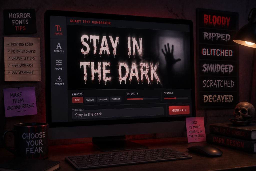
A scary text generator turns plain words into horror-style Unicode fonts you can copy and paste into any message, bio, or caption. But here’s what most generators won’t tell you: the “scariest” looking font usually isn’t the one that scares anyone. The styles that actually unsettle people are the ones that stay just readable enough to land before the brain shrugs them off as gibberish.
That distinction, readable-creepy versus unreadable-chaos, is the entire game. A blood-drip font works great on a Halloween flyer headline. It fails completely in a one-on-one text message, where the recipient needs to read the words to feel anything. This guide is built around that practical split: which horror font for which message, and why.
If you want the mechanics of cursed text itself, what Unicode combining marks are and how distortion is built, that’s covered in our complete guide to cursed text. This article is about using horror fonts with intent.
What Makes a Font “Scary” Instead of Just Decorative
Horror fonts work by triggering a specific kind of discomfort: something that looks like language, but wrong. Your brain processes it as text first, then notices the wrongness a half-second later. That delay is where the unease lives.
There are three ways a font creates that effect, and most scary text generators blend all three into one slider:
- Shape distortion, letters with dripping, jagged, or melting edges (blood fonts, gothic blackletter)
- Structural corruption, marks stacked on or around letters that make the text look damaged (glitch and Zalgo styles)
- Substitution, swapping normal letters for unfamiliar symbols from other Unicode blocks, which reads as foreign or otherworldly rather than broken
Each one sends a different message to the person reading it. Knowing which effect you’re going for changes which generator setting you actually want.
Match the Font to the Message: Not the Other Way Around
This is the part most “creepy font” roundups skip. Picking a scary font isn’t about finding the most extreme option, it’s about matching intensity to where the text is going.
Texting a friend or messaging in a group chat
Keep it light on distortion. A message someone has to squint at for ten seconds before reading isn’t scary, it’s annoying. Subtle glitch text, a few combining marks per letter, not dozens, keeps every word legible while still looking off.
Example: “ɪ ᴄᴀɴ sᴇᴇ ʏᴏᴜ” using small caps or light Unicode substitution reads instantly and still feels uncanny. The same line buried under heavy Zalgo marks just looks like a copy-paste error.
Halloween captions and social bios
This is where you can push intensity higher, because the reader isn’t trying to parse a conversation, they’re scrolling and reacting to a vibe. A bio that says “𝕯𝖔 𝖓𝖔𝖙 𝖋𝖊𝖊𝖉 𝖎𝖋 𝖋𝖔𝖚𝖓𝖉” in a gothic blackletter style does its job in one glance.
Horror fiction, creepypasta, and ARGs
Here, escalating distortion across a piece of writing is actually a storytelling tool. A creepypasta that starts in normal text and slowly degrades into heavier glitch or Zalgo marks as the narrator “loses control” mimics the structure of found-footage horror. The font becomes part of the plot, not just decoration.
Pranks and jump-scare messages
The trick with prank texts is restraint, then a single payoff line. Send two or three completely normal messages, then drop one short line in heavy distortion. The contrast does the work, if every message is maximum chaos, nothing stands out.
The Four Horror Font Families Worth Knowing
Most scary text generators sort their output into categories, but the labels vary by site. Here’s what they actually mean and when each one earns its place.
Blood drip and slasher fonts
These render letters with dripping or jagged shapes, often using box-drawing or block characters to fake a 3D melt effect. They’re built for short words and titles, “BEWARE,” “HAUNTED,” a single name, not paragraphs. Past four or five words, the dripping effect makes letters blur together and readability collapses fast.
Gothic and blackletter styles
Medieval-looking, sharp-edged letterforms (think old horror movie title cards). These are the most readable of the bunch even at full intensity, which makes them the safest choice for anything longer than a headline, a paragraph of horror fiction, an “about” section for a haunted house event, a longer caption.
Glitch text
Moderate Unicode combining marks layered onto normal letters to look like a corrupted file or broken signal. This is the workhorse style for messages and usernames because intensity is adjustable, light glitch stays fully readable, heavy glitch starts to break down.
Zalgo and corrupted text
The most extreme end of the spectrum, originating from a well-known 2004 internet horror creepypasta. At full strength it’s intentionally close to unreadable, which is exactly why it works for single-word impact (a username, a one-line jump-scare) and fails for anything you need someone to actually read start to finish. For the backstory on where this style came from, see our breakdown of Zalgo text and its creepypasta origins.
Readability vs. Intensity: The Trade-Off Nobody Mentions
Every horror font generator has some version of an intensity slider, and the instinct is to max it out. Resist that instinct for anything longer than a word or two.
Here’s the practical rule: readability drops roughly in proportion to how many marks or substitutions are layered per letter. A style with one or two marks per character stays readable in nearly any font, on any device. Cross into four or five marks per character and you’re relying on the reader’s device rendering Unicode correctly, which isn’t guaranteed.
This matters more than people expect because of platform inconsistency. The same heavily-distorted text can look perfectly creepy on one phone and render as a row of empty boxes on another, depending on the operating system’s font support. If a message needs to land reliably, dial back the intensity until it’s legible on a plain test message first.
Platform Considerations That Change Your Font Choice
Not every app handles horror fonts the same way, and this changes which style actually works.
Text messages (iMessage/SMS): Stick to light-to-moderate styles. Heavy Zalgo can occasionally cause rendering issues on older Android devices.
Instagram and TikTok bios: These render Unicode cleanly, so gothic and substitution styles look crisp. Avoid maximum-intensity glitch here, bio character limits get eaten up fast by heavy combining marks.
Discord: Handles almost everything well, including heavy Zalgo, which is part of why Discord servers are where the most extreme horror text usually shows up. See our guide to cursed text for Discordfor setup specifics.
Gaming usernames (Roblox, etc.): Many games filter non-standard Unicode entirely. Test a light style first, the Roblox-specific cursed text guide covers what actually gets accepted.
Building a Creepy Message Sequence: Not Just a Single Line
One thing competitive “scary font” pages rarely cover: scary text works better as a sequence than a single output. If you’re using horror fonts to build tension across multiple messages, for a prank, an ARG, or a horror-themed post series, structure matters more than any individual font choice.
A pattern that consistently works:
- Normal text to establish a baseline
- Light distortion on a message that seems almost normal, planting unease
- A short, heavily distorted line as the payoff, five words or fewer
- Silence, or a return to normal text, which lets the previous message sit with the reader
This mirrors horror pacing in film and fiction: calm, a small wrong detail, a spike, then quiet. A wall of maximum-intensity text from message one has nowhere left to escalate to.
Quick Reference: Font Style by Use Case
| Use Case | Best Style | Why |
| Texting a friend | Light glitch or substitution | Stays fully readable |
| Halloween Instagram bio | Gothic or blood-drip | Reads at a glance, short text |
| Horror story narration | Gothic, escalating to glitch | Long-form readability |
| Single jump-scare line | Heavy Zalgo | Intensity over clarity, short burst |
| Discord username | Glitch or moderate Zalgo | Platform renders it reliably |
| Gaming username | Light substitution | Avoids character filters |
Try It Yourself
Reading about font intensity only goes so far, the difference between a light glitch effect and a heavy Zalgo overload is something you’ll feel the moment you see your own words distorted. Open the free cursed text generator, type a test message, and slide the intensity up gradually instead of maxing it out immediately.
Test it the way you’d actually use it: paste a short line into a draft text message and see if you can still read it in two seconds. If you can, it’ll work. If you can’t, dial it back. That one habit will save you from sending unreadable horror text more often than any rule in this guide.
Frequently Asked Questions
What’s the difference between a scary text generator and a regular font generator?
A regular font generator changes letter style for aesthetics. A scary text generator specifically applies horror-coded effects, dripping, corruption, or unfamiliar symbol substitution, designed to create unease rather than just visual variety.
Will scary fonts work in all caps?
Yes, and for short titles it often helps. All caps plus moderate distortion reads as more aggressive without needing heavier marks, which keeps the text legible while still looking unsettling.
Can I use a scary text generator for free?
Yes. Browser-based Unicode generators don’t require downloads, accounts, or payment, they apply combining characters and symbol substitutions that exist in standard Unicode, not custom fonts that need licensing.
Why does my creepy text look different when my friend opens it?
Different operating systems and apps render Unicode combining marks differently. Heavier distortion is more likely to display inconsistently across devices than lighter styles, this is a rendering limitation, not a generator bug.
Is there a “safest” scary font for professional or semi-public use?
Gothic and blackletter styles read as intentional and stylized rather than broken, which makes them the most appropriate choice for things like event invitations or branded Halloween content where you still want clear communication.
What’s the most popular scary text style right now?
Glitch text remains the most-used style for everyday posting because it balances visual impact with readability. Zalgo gets more attention for maximum shock value but is used far more sparingly because of its readability trade-off.
Pingback: Fortnite-Glitch-Namen-Generator: 150 kreative Ideen
Pingback: Gerador de nomes glitch Fortnite: 150 ideias de nicks
Pingback: Fortnite glitch naam generator: 150 originele ideeën
Pingback: Generator Nama Glitch Fortnite: 150 Ide Username
Pingback: Void-Symbol-Bibliothek – Dunkle Unicode-Symbole kopieren
Pingback: Libreria di simboli Void | Simboli Unicode scuri
Pingback: Biblioteca de símbolos Void | Unicode oscuro para copiar
Pingback: Cursed Text für Twitter/X – Glitch- und Zalgo-Schriften
Pingback: Cursed Text per Twitter/X – Font glitch e Zalgo
Pingback: Cursed Text pour Twitter/X – Polices Glitch et Zalgo
Pingback: Cursed Text para Twitter/X – Fuentes Glitch y Zalgo
Pingback: Cursed Text para Twitter/X – Fontes Glitch e Zalgo
Pingback: Cursed Text voor Twitter/X – Glitch- en Zalgo-lettertypen
Pingback: Cursed Text na Twitter/X – Czcionki Glitch i Zalgo
Pingback: Twitter/X için Cursed Text – Glitch ve Zalgo Yazıları
Pingback: Cursed Text für Instagram – Gruselige Bio- & Caption-Schrift
Pingback: Cursed Text per Instagram – Font per bio e didascalie