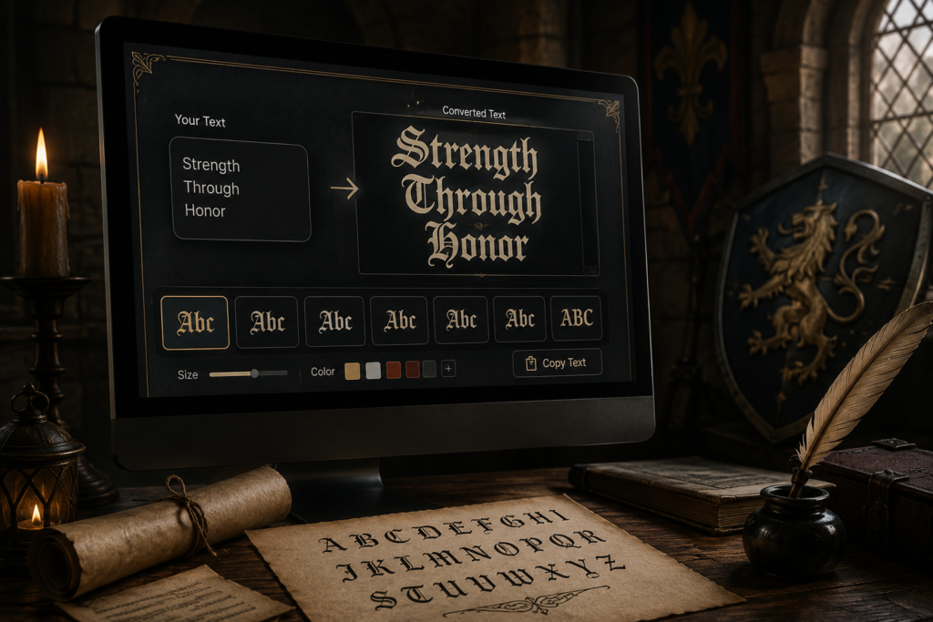
A gothic text generator takes plain letters and swaps them for blackletter-style Unicode characters, the dense, angular lettering you’d recognize from old manuscripts, metal band logos, or the opening title card of a horror film, so you can copy and paste the result anywhere, no font download required. Type “midnight,” get something that looks like it was lifted from a medieval scroll. Under the hood, though, it’s still just text. Your phone already supports it.
That covers the quick version. What most pages on this topic leave out is more useful: there isn’t really one “gothic font,” the trick behind these generators has real limits worth knowing before you use one for something permanent, and the right choice depends a lot on what you’re actually making. A tattoo reference, a band logo, a wedding invitation, and a Discord display name don’t call for the same approach, even though a generator will hand you the same alphabet for all four.
What’s Actually Happening When You “Convert” Text to Gothic
Here’s where a lot of people get tripped up. A gothic text generator isn’t applying a font, at least not in the way design software does. A font is a file your device reads to draw letters a certain way, Garamond, Helvetica, whatever. A website has no power to make your phone use a font it doesn’t already have installed.
What’s actually going on is simpler and a little stranger: the generator is swapping your regular letters for a different set of characters that already live inside the Unicode standard. Specifically, they come from the Mathematical Alphanumeric Symbols block, a section originally built so math notation could distinguish between, say, a regular variable and a Fraktur-styled one in formal logic. Somewhere along the way, people noticed that block also happens to contain a full Fraktur alphabet, in both regular and bold weight, and started using it for exactly the purpose it was never designed for: making text look medieval.
So when you type “Hello” and get back something resembling old German print lettering, you haven’t picked up a new font. You’ve picked up different characters that look the part. And because they’re characters rather than a font, how they render depends entirely on the device reading them. Most current phones and laptops handle this part of Unicode without issue. Older Android devices, certain in-app browsers, and plain-text-only fields, some old username systems, a handful of form inputs, sometimes strip the characters out or show blank boxes instead. If you’re about to use gothic text somewhere you can’t easily undo, paste it into that exact field first and look before you commit.
For more on how these Unicode substitution tricks work in general, including the combining-mark techniques used for distorted or glitch text, our complete guide to cursed text goes deeper into the mechanics.
Gothic Isn’t One Style: Here’s What Generators Are Actually Giving You
Calling something “gothic font” online has turned into a catch-all, but historically the term covers several distinct blackletter traditions, each tied to a different century and region. Knowing the differences explains why two gothic text generators can produce noticeably different-looking output for the exact same word, and why neither of them is wrong.
Textura came first. It’s the rigid, narrow style used in religious manuscripts and famously in the original Gutenberg Bible, beautiful on a printed page, nearly unreadable in a sentence of digital text, which is why almost no generator actually uses it.
Fraktur is the one that matters most here, because it’s the style Unicode actually built into its Mathematical Alphanumeric block. It dominated German printing for centuries: angular but a bit more open than Textura, which is probably why it’s the version that survived into the copy-paste era. When people picture “gothic font,” this is usually the shape they’re picturing.
Schwabacher is a rounder, softer German variant that mostly gets left out of generators, simply because Unicode never gave it a dedicated character set.
Old English, or Engravers Gothic, is the British and American branch of the family, the style behind newspaper mastheads (the New York Times logo is the famous example) and varsity sports lettering. It’s a real, distinct typeface in design software, but Unicode doesn’t include it directly. So most browser-based generators fake it using Fraktur, which is close enough for casual use but not quite the same letterforms.
Worth remembering: if a site promises “Old English gothic text,” what you’ll actually receive is Unicode Fraktur, because that’s the only blackletter alphabet built into a standard you can copy and paste. Getting true Old English letterforms, for a logo, a flyer, an actual tattoo design, means leaving the generator behind and opening real font software, whether that’s Canva, Photoshop, or a dedicated typeface like UnifrakturMaguntia. The generator is fast and free. A real font file is precise. They solve different problems.
Where Gothic Text Actually Shows Up
Horror content gets a lot of attention here, but it’s honestly a smaller slice of how this style gets used than you’d think.
Metal and rock bands have leaned on blackletter for their logos for decades, it signals weight and tradition without a single word of explanation. A generator is a fast way to test a band name or album title before someone draws a custom logo around it.
Tattoo lettering is a quieter but very common use case. People run a name or phrase through a gothic generator just to get a feel for how it might sit on skin before bringing it to an artist. One caveat worth flagging: a tattoo artist will almost always redraw the lettering by hand for proper line weight and flow. Treat the generator output as a sketch, not the final design.
Wedding stationery is an unexpected one but it works, old-world lettering for a save-the-date header, an invitation title, or a couple’s monogram. This is also where restraint matters most. Blackletter across a full paragraph of invitation copy turns into a readability headache fast; a single styled word like “Together” at the top of the card reads as elegant instead.
Fantasy gaming and tabletop RPGs use it constantly, character names, guild titles, campaign document headers for Dungeons & Dragons and similar games. A guild name set in Fraktur does more for the mood of a campaign in one glance than a paragraph of flavor text would.
Breweries, distilleries, and other old-world-leaning brands reach for blackletter on labels and signage all the time, even when the business itself opened last year. It reads as established.
And then there’s the casual end of things, a stylized bio line or username, which is probably how most people stumble onto a gothic text generator in the first place, since it stands out against a feed full of plain sans-serif text.
If horror specifically is what brought you here, Halloween captions, creepypasta, jump-scare-style messages, our scary text generator guide walks through when gothic fonts beat out glitch or Zalgo for that kind of writing, and when they fall short.
The Readability Trade-Off Nobody Mentions
Blackletter was designed for handwritten and hand-set print, not for screens, and that history shows up in a few predictable ways once you start reading it at normal text speed.
Lowercase u and n look almost identical in a lot of Fraktur styles. Lowercase v and r blur together at small sizes. And capital letters, somewhat counterintuitively, are often the hardest part to read, since that’s where the decorative flourishes pile up.
This lines up with something our scary-text guide also notes, that gothic and blackletter styles are the most readable of the horror-adjacent font families, but that’s a relative claim, not an absolute one. Readable compared to Zalgo, sure. Readable in a dense paragraph at a small font size on a phone screen? Not really. The workaround is simple: save gothic lettering for short stretches of text, titles, names, single words, and let everything past a sentence sit in a normal typeface.
A Few Things Worth Doing Differently
Some habits separate gothic text that looks deliberate from gothic text that just looks broken.
Keep it to headlines, not paragraphs. A gothic title sitting above plain body text reads as designed. An entire block of blackletter reads like something went wrong with the font.
Test the platform before it matters. Paste into the actual bio, username, or caption field first, not a notes app, especially if it’s somewhere you can’t change later without friction.
Use weight on purpose. Most generators give you both regular and bold Fraktur. Bold suits short, punchy words. Regular weight is easier to scan once you’re past two or three words.
Don’t stack it with glitch or Zalgo marks. Combining blackletter with heavy combining characters tends to cancel out the one advantage blackletter had, that it’s actually readable.
Treat the generator as step one, not the final product. For anything permanent, tattoos, printed merchandise, an actual logo, use the generator to settle on wording and rough feel, then move into real design software for the version that ships.
Frequently Asked Questions
Is gothic text from a generator the same thing as a real font?
No. It’s a separate set of Unicode characters that happen to look like Fraktur blackletter, not an installed font file. That’s the whole reason it works by copy-paste anywhere, with nothing to download.
Why do some gothic letters show up wrong or missing after I paste them?
The app or device on the receiving end doesn’t fully support that part of Unicode. It happens more on older Android phones and in plain-text-only fields than on modern phones or social apps.
Can gothic Unicode text be used for an actual business logo?
You can use it to test wording and get a feel for the style, but a real logo should be set in a licensed typeface inside design software. Unicode gothic characters can’t be resized, kerned, or recolored the way a true font can.
What’s the difference between “gothic text” and “Old English text” generators?
In practice, almost nothing. Most generators labeled either way are pulling from the same Unicode Fraktur block, since genuine Old English letterforms were never added to the Unicode standard.
Does gothic text hold up for full names and longer phrases, or just single words?
Technically it works at any length, but readability drops noticeably past a handful of words, especially in bold. Short names, titles, and headers are where it earns its keep.
Is there a gothic version of both uppercase and lowercase letters?
Yes, the Unicode Fraktur block covers both cases plus a separate bold weight, so you’ve got four style variants total depending on which letters you start typing with.
Pingback: Libreria di simboli Void | Simboli Unicode scuri
Pingback: Cursed Text für Instagram – Gruselige Bio- & Caption-Schrift
Pingback: Cursed Text per Instagram – Font per bio e didascalie