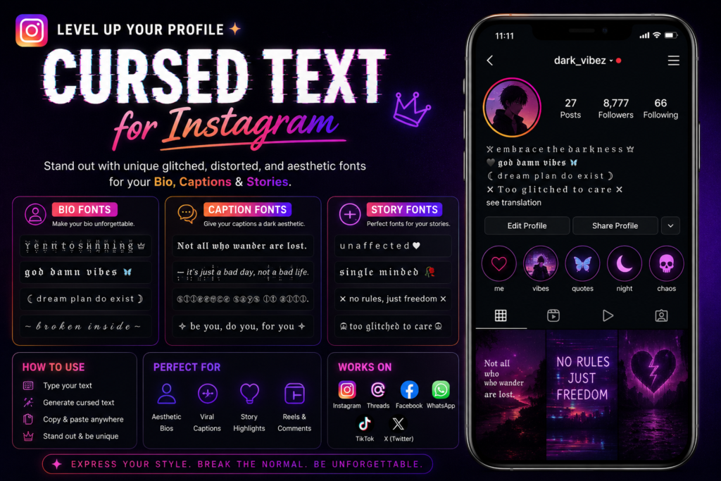
To use cursed text on Instagram, generate the Unicode style you want, then paste it directly into the bio field, caption box, or Story text tool, no app, download, or special keyboard required. Instagram treats it as plain Unicode text, not a custom font, so it copies and pastes exactly like any emoji would. The part that actually trips people up isn’t getting it onto the platform. It’s picking a style that survives Instagram’s specific quirks: a 150-character bio limit that eats up fast when combining marks are involved, a Stories text tool that sometimes reformats what you paste, and search behavior that treats distorted letters as invisible to the algorithm. This guide covers exactly where each of those problems shows up and how to work around them.
Where Cursed Text Actually Goes on Instagram
Instagram has four text surfaces, and cursed text behaves differently in each one.
Bio. This is the tightest space on the platform, 150 characters, no exceptions, and Instagram counts every stacked Unicode mark as its own character even though it visually looks like it’s sitting on top of a letter. A name with three combining marks per letter can burn through your bio limit before you’ve written a single sentence about yourself.
Captions. The most forgiving surface. Caption limits run into the thousands of characters, so heavier styles have room to breathe here in a way they never do in a bio.
Story text. This is the one people get burned by most. Instagram’s Story text tool sometimes auto-adjusts font size, alignment, or line spacing based on what it detects in the string, and dense combining-mark text occasionally triggers that auto-resize in ways a plain sentence wouldn’t. Always preview before posting; don’t trust how it looked in your notes app.
Comments and DMs. Functionally identical to captions in terms of what renders, but character limits are shorter than captions, so the same bio-style discipline applies.
Platform Compatibility: What Actually Renders
Instagram’s apps (iOS and Android) render standard Unicode combining characters and symbol substitutions without stripping them, which is why cursed text works there at all, the platform simply isn’t filtering the character set the way some gaming platforms do. That said, three compatibility issues show up consistently:
A bio that looks perfectly stacked on your phone can shift by a pixel or two on desktop Chrome, since font rendering engines position combining marks differently across operating systems. When someone gets a push notification quoting your caption, some notification systems render a simplified font that doesn’t stack marks the same way the main app does. Your caption is fine, the preview just won’t do it justice. If accessibility matters for your audience (and for a public-facing bio, it usually should), heavy distortion is the first thing that breaks VoiceOver or TalkBack.
None of this means cursed text doesn’t work on Instagram, it clearly does. It means the style you pick needs to match the surface you’re putting it on.
Bio-Specific Character Math (The Part Everyone Skips)
Here’s the number nobody puts in these guides: a 150-character bio with heavy Zalgo-style distortion (three or more combining marks per letter) can realistically fit only 30–40 actual letters before you hit the ceiling. Light distortion, one mark per letter, gets you closer to 75 letters. Letter-substitution styles (small caps, bold Unicode, gothic blackletter) don’t add extra characters per letter at all, since they’re swapping one character for one character rather than stacking marks on top.
That math changes the decision entirely. If your bio needs to say something, a tagline, a link callout, an emoji row, a pronoun note, heavy Zalgo isn’t a style choice, it’s a math problem. A single distorted word as an accent (your name, one adjective) paired with normal text for the rest of the bio gets you the aesthetic without sacrificing the information your bio is actually there to communicate.
A workable split:
cursed or gothic style, since it’s short and sets tone immediately normal text, so people actually read what you do normal text, always, this is not the place to be cute with Unicode
Creative Ideas by Content Type
Aesthetic and mood-board accounts
Letter substitution styles, small caps, circled letters, gothic blackletter, read as intentional design choices rather than glitches. These pair well with minimalist grid layouts because the text itself becomes a visual element instead of competing with the photo. For the specific letterform approach behind blackletter styling, the gothic text generator breakdown covers how that lettering is built and why it reads as deliberate rather than broken.
Horror, ARG, and alt-lore accounts
This is where heavier distortion earns its place, especially in captions rather than bios. An account building a fictional narrative across posts can use escalating distortion the same way a creepypasta does, starting clean, degrading over a series of posts as “something goes wrong” in the story. The scary text generator guide covers this pacing technique in more depth if you’re building a multi-post arc rather than a single caption.
Personal accounts wanting a distinct bio
The safest move is restraint: one distorted word (your name, a single mood descriptor) surrounded by clean, readable text. This gets you noticed without making your bio illegible to anyone who isn’t already primed to decode it.
Meme and reaction-post accounts
Story text is the best surface here because the format is disposable by design, a 24-hour post can afford to be more chaotic than a permanent grid caption, since nobody’s searching for it later.
The Searchability Problem Nobody Mentions
Here’s the trade-off that most “cursed text for Instagram” content skips entirely: Instagram’s search and hashtag system reads Unicode-substituted characters as different characters than their plain-text equivalents. If your bio says your name in small-caps Unicode instead of plain ASCII letters, someone searching your actual name in Instagram’s search bar may not find your account, because the platform’s search index is matching character strings, not visual appearance.
This matters most for:
- Business and creator accounts, where being found by name search directly affects reach
- Usernames (though Instagram usernames themselves are more restrictive about accepted characters than bios or captions, so this mostly applies to display names and bios)
- Hashtags typed in cursed text, which won’t link to the standard hashtag page at all, since Instagram’s hashtag system only recognizes standard alphanumeric characters
The practical fix: keep your actual searchable name in plain text somewhere in your profile, even if your bio’s headline uses a distorted style, and never distort text you’re using inside a hashtag.
Readability Rules for Instagram Specifically
Instagram is a scroll-fast platform. Unlike a Discord message someone’s actively reading in a conversation, a caption or bio on Instagram competes with a feed full of other content for about half a second of attention before someone decides to keep reading or scroll past.
That changes the distortion math from what you’d use in messaging apps:
- Bios need to be readable in one glance, since that’s often all the attention a profile visit gets before someone taps away
- Captions can absorb more distortion if the payoff word or line is near the top, since Instagram truncates captions after a few lines and shows “more”, burying your cursed text below the fold defeats the purpose
- Story text benefits from higher contrast, not just distortion, a Story is already visually busy with stickers, tags, and the photo or video underneath, so text that’s both distorted and low-contrast disappears fast
If you’re unsure whether a specific string is too heavy, the same two-second test applies here as anywhere else: paste it into a note to yourself, glance at it once, and see if you can read it without already knowing what it says.
Best Practices Checklist
- Front-load anything important, links, calls to action, your actual name, in plain text, especially in a bio
- Test on both notification preview and the main app before publishing, since they can render differently
- Use letter-substitution styles for anything long, and reserve heavy combining-mark styles for single words or short accents
- Don’t distort your username or hashtags, Instagram’s search won’t recognize them
- Check your bio character count with the actual generated text, not your plain-text draft, since stacked marks count individually
- Match intensity to permanence, Stories can be louder and messier than a permanent grid caption or bio, since Stories disappear in 24 hours
Frequently Asked Questions
Does cursed text reduce my Instagram reach or get flagged by the algorithm?
There’s no evidence Instagram penalizes standard Unicode characters simply for looking stylized, they’re valid, standard characters, not a policy violation. The real reach cost is indirect: distorted text doesn’t get picked up by name or hashtag search the way plain text does, which limits discoverability rather than triggering any kind of suppression.
Why did my Story text look fine in preview but change after I posted it?
Instagram’s Story editor sometimes auto-adjusts font sizing and spacing based on the string length and character density it detects, and dense combining-mark text can trigger that adjustment differently than plain text would. Always check the story after it’s live, not just in the editor.
Can I use cursed text in my actual Instagram username, not just my bio?
Usernames are far more restricted than bios or display names, Instagram generally limits usernames to letters, numbers, periods, and underscores, so most cursed text styles won’t save at all in that field. Display names and bios have much more Unicode flexibility.
Is there a “safe” amount of cursed text for a business or creator account?
Restraint is the safer default, a single stylized word in your bio headline, with your actual business name, contact info, and links in plain text. That protects both searchability and readability without giving up the aesthetic entirely.
What’s the difference between using cursed text here versus in a Discord bio or Reddit post?
Instagram is a faster-scrolling, more search-dependent platform than Discord, so the same intensity that works fine in a Discord profile can hurt discoverability on Instagram in a way it never would on Discord. If you’re comparing platforms directly, the trade-offs are covered in more general terms in our broader cursed text meaning guide, which looks at how intensity signals different things depending on where it’s read.
Do I need to build the marks manually, or is a generator fine for Instagram use?
A generator is fine and faster for nearly all Instagram use cases, bios and captions are short enough that manual construction offers no real advantage. If you’re curious about what’s actually happening character-by-character, the manual Zalgo technique guide walks through building it by hand, though it’s more useful for understanding the mechanics than for everyday posting.
Pingback: Beste Cursed Text Generatoren im Vergleich (2026)
Pingback: Générateur de noms glitch Fortnite : 150 idées
Pingback: Generator nazw glitch Fortnite: 150 pomysłów na nick
Pingback: Generator Nama Glitch Fortnite: 150 Ide Username
Pingback: Cursed Text für Twitter/X – Glitch- und Zalgo-Schriften
Pingback: Cursed Text para Twitter/X – Fuentes Glitch y Zalgo
Pingback: Cursed Text para Twitter/X – Fontes Glitch e Zalgo
Pingback: Cursed Text voor Twitter/X – Glitch- en Zalgo-lettertypen
Pingback: Twitter/X için Cursed Text – Glitch ve Zalgo Yazıları
Pingback: Cursed Text pour Twitter/X – Polices Glitch et Zalgo